
Learning About Visual Accessibility
Visual web accessibility is not something I frequently thought about until recently. I had assumed that anyone would be able to use and navigate the products I designed, regardless of visual impairments. For too long, I subconsciously thought that my “designer eye” would catch anything that people might find difficult to read or see. I’ve since learned that the best approach is to maintain a consistent practice of looking through the eyes of someone who can’t look through yours. Visual web accessibility can get complex but don’t worry; there are some simple things that we can do that can help elevate our designs so everyone can enjoy them.
What is Visual Web Accessibility?
Visual web accessibility is a standard that ensures everyone, regardless of the extent of their impaired vision, color blindness, or blindness, can use a digital product with as much ease as possible. It’s the discipline of accounting for text size, color contrast, and clear CTAs so visually imparted individuals can use the product. A common misconception is that visually accessible websites cannot be visually stunning. I’ve noticed that incorporating accessibility elevates the usability and aesthetic of the product.
How do I achieve Visual Web Accessibility?
Technically, three degrees of visual web accessibility can be identified as suitable for low vision, color blindness, and blindness. The WCAG 2.0 (Web Content Accessibility Guidelines), recognized by the federal government and many other nations, gives guidance to ensure that visual web accessibility is achievable. These guidelines determine the testing methods and the standard we need to meet. Some of the most common tests analyze the contrast ratio and focus on compliance levels that cover low vision and color blindness.
Contrast Ratio
Using contrast ratio as a measurement, we can determine how easy it is to distinguish text from its background. The measuring system makes sure that we satisfy the accessibility standards for contrast. The way it works is like this. Starting at a 0 contrast ratio, this is represented by a 1:1 - this interprets as white text on white background. A 21:1 ratio means black text on a white background. All the numbers between these ratios represent the amount of contrast a hue has against a white background.
Levels of Compliance
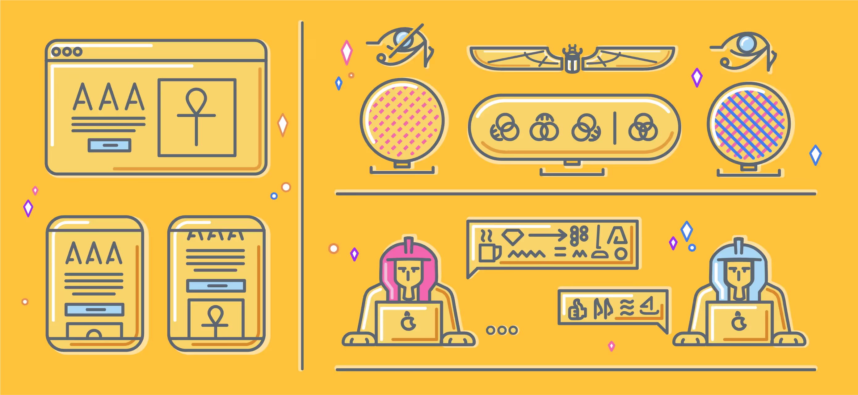
The compliance levels mainly address users with low vision, referring to anyone who has difficulty reading specific font sizes or fonts that don’t have enough contrast. To ensure the proper contrast and font size is met, the WCAG 2.0 provides the levels of compliance. There are three levels of compliance in total, and they are known as A (lowest), AA (mid-range), and AAA (highest).
These levels work based on cumulation, so conformance at higher levels indicates conformance at lower levels. For example, a Web page meets both the A and AA compliance levels by conforming to AA. Level A sets a minimum level and does not achieve impactful accessibility. For this reason, W3C (an organization that’s a global leader in web accessibility) recommends AA conformance for all web-based information. AAA levels are typically the required standard for government, education, or charity websites.
To determine if you are using the right size and font contrast, you can download an accessibility plug-in for whatever design tool you’re using.
Plugins
Most accessibility plugins not only tell you if you're meeting a certain level of compliance, but they'll also tell you what the contrast ratio is as well. On top of that, most of these plugins have vision simulations for different types of color blindness. These tools are handy when using color as a status indicator or a CTA. If you're solely relying on color for some of these indicators, it might be time to re-think the UI to see if you can make it more straightforward for everyone. Here is a list of some handy plugins for various product design software.
Able - Figma Able is one of the best plugins that I've found. It's incredibly powerful because it constantly updates the test results as long as you select two elements that have a foreground and background. It can swap the colors so you can preview a dark mode component. It also has a vision simulator for the most common color blindness symptoms.
Stark - Figma, Sketch, Adobe XD What makes Stark so valuable is its multiple design software functionalities, and in my opinion, it is a little bit easier to understand. I mainly use this one for contrast ratio for text because it shows you your target ratios. The only thing I don't like about this plugin is that you have to first select the two elements that you want to test in your design doc, then launch the plugin, and you have to pay for the vision simulator for color blindness. Otherwise, this is an excellent plugin.
WebAID (contrast checker) If the word plugins scare you, or you use some design tool that doesn't have an accessibility testing feature (first off, maybe it's time to upgrade), this is an excellent resource. It's a free website that allows you to test the hex values of your components, it requires a few more steps, but it gives you the same result as the plugins mentioned above.
The All Seeing Eye is fascinating, and learning more about it will make you more valuable as a designer or developer. It will help you be a source of relief for those living with visual disabilities. As mentioned before, just because you've got great vision doesn't mean you're always able to make the right calls about accessibility. Your eyes alone are not enough. Leaning on the available tools and resources will broaden your already perfect vision to be able to see even more.
I've provided some links that I used to write this article that are excellent sources to learn more, but honestly, I've only scratched the surface. We didn't even talk about people who are blind, or deaf, or nearly paralyzed. There is a whole world of accessibility out there, and everyone wins if we, as designers, learn more about it. Let's make sure that everyone can appreciate how extraordinary our designs are—the more eyes on them, the better.
Sources